Pretty much. I'm fond of saying that you can learn a lot about something by looking at its shadow and in this case that meant broadening my search to move away from Islamic/Spanish playing cards to Medieval/Renaissance playing cards in general. Which turned up this:
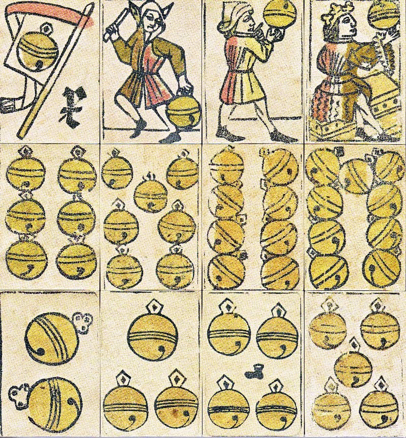
Image 1

Image 2
Image 2
These are part of a 16th Century deck from Basel. You can find variation on this design from the 15th to the 18th Centuries and they've been reprinted in the 20th and 21st Centuries. And once I started trying to understand this deck I was lost. You see, the Swiss and the Germans took to playing cards with a zeal that doesn't border on ferocious because ferocious is so far back in the rearview mirror you couldn't see it from the top of a very high peak. I've counted over 27 different suits used in Swiss/German cards from the 15th to 17th Centuries and I'm positive I haven't found them all. The study of playing cards really is something of a rabbit hole.
This deck was unique in that it was complete. That's a rare thing to find. There can't be more than ten decks from before the 17th Century that are complete. There are a lot of partial decks (and partial cards, for that matter) but none are complete. And the imagery of this deck appealed to me. Probably because it's very simple in comparison to some of the other decks. So I decided to make some.
Early experiments were interesting. I quickly determined that hand drawing these cards was not going to work for me. Almost as quickly I determined that making these cards on authentic paper, with proper paints was a) beyond my artistic skills and b) going to be very expensive. That wasn't good. I wanted to make a little money at this, yes, but I also wanted a bunch of people to be able to use these cards.

Image 3

Image 4
In Image 3 and Image 4 you can see some cards I made in a compromise technique. I printed the designs onto 150gsm paper (a cardstock) and then glued the printed sheet to a backing sheet to make a 300gsm sheet of cards that I then cut out by hand. All I can see here are the failures. The unter/under/jack of bells in Image 3 clearly shows the cards are too large in relation to the artwork. In Image 1 we can see the artwork nearly fills the entire card and in other surviving decks/cards we can see the artwork is sometimes cut off because it was so close to the edge. These cards were way too thick. I think. We don't have a lot of information on how thick the cards actually were, but I think these are way too thick. They're also black and white. If you see a surviving deck in black and white that's because it was a printer's reject sheet that was recycled for something else. Cards were colored. By hand, by stencil, by whatever method. But they were colored.
Ultimately I decided to go with a professional printing service. I chose a print on demand service because I had no money to pay for a small print run (500 decks). That drove up the cost of each deck but kept the price fairly low and allowed me to ensure the cards remained available without having to do another print run if I ran out of cards from the first run (ha!). After experimenting I ended up choosing Printer's Studio and got my first set of cards.

Image 5
I like the way the cards turned out, but everything about them is a problem. The colors are perceived by customers as being too bright. I'll admit the palette could benefit from some tweaking to more closely approximate surviving examples, but indications are that Medieval painting *was* quite bright. The cards are too white for a lot of people; they don't convey that 'olde tyme' feeling that sepia-toned paper does. Again, Medieval paper was frequently coated with a mixture of starch (binder) and chalk (pigment) to make it whiter and smoother. Frankly, Medieval paper was frequently of a higher quality than the wood pulp stuff we commonly use now. The margins around the artwork were unavoidable. Modern printers simply won't accept the losses that Medieval printers were willing to accept and they demand quite a large margin around the artwork. The rounded corners are, in my mind, even worse. Medieval playing cards had square corners. This deck has a patterned back. That's one of the benefits of using a professional printing service. I could never have done uniform backs on my own.

Image 6
In Image 6 you can see 10 of the almost 30 suits I put together from documented examples. Well.... almost. When I made the swords and coins I thought I was being.... creative. You see, swords and coins are part of the Latin-style card decks and aren't Swiss/German at all. Except they turned out to be Swiss/Italian and very well documented. I've changed the designs and the layout to more accurately reflect the historical examples and added cups and batons/staves as well. To the right you can see some examples of card backs that I experimented with.
So what are you seeing? The Swiss/German deck layout typically has pip cards (the number cards) from 2 to 9. There is no one/1/ace. In the Swiss influenced decks the ten is typically a banner bearing the suit symbol and an X serving as a Roman numeral ten. In the German influenced decks the ten is generally another pip card (ten suit symbols) with a Roman number ten somewhere on the card (typically the middle of the card or the top of the card). The ten in both decks frequently serves the same purpose as the ace in modern decks. In the example above you can see modern style aces. I added those to make the deck more flexible; you can set them aside to play period games or include them to play modern games. The court cards are an unter/under, ober/over, and konig/king. The unter is the equivalent of the jack and he is the under because the suit symbol is low on his card. The ober is the equivalent of the queen and his the over because the suit symobl is high on his card. The king is seated upon a throne and wears a crown. He also wears a long robe which is a detail that becomes important when dealing with the French decks.
No comments:
Post a Comment